by Shweta Patel

Having a mobile app is an increasingly vital part of any company’s strategy. In fact, consumers are using their phones for three hours each day, and the large majority of that time is spent using apps rather than making calls or texting, according to Twin Prime, a new mobile content acceleration company.
However, many businesses apps get dropped by customers, sometimes in favor of a competitor’s version. Much of the time people are quick to drop apps that run slowly. Providing consistently fast connections is difficult, but there’s hope. Twin Prime suggests adjusting and updating the app as new phones enter the market to keep up with emerging technology and using an automated system is also recommended.
One of the most discouraging statistics for all app professionals out there is that people abandon the majority of apps they download, some even after using them just once. Sure, we might have spoiled users a bit by creating awesome apps, and they might have gotten used to getting crazy good products, but we can’t lay the entirety of the blame on their standards.
Check out more tips and stats in the infographic below.
Below you’ll find some of the most frequent reasons why people leave your apps, as well as tips and tricks how to eliminate them.
1. 70% of apps are abandoned after the first week, and it often comes down to stale content.
2. If you want customers to come back to your app day after day, provide them something new and original each time they open the app.
3. These rich content updates can be in the form of a flash sale, a daily comic, a stream of user-generated photos, a loyalty or achievement program, or something as simple as resetting activity limits.
4. Whatever shape your reason to come back takes, as customers come to expect fresh content, they’ll get into a routine of regularly launching your app to see what’s new and exciting.
5. People can only look at the same content for so long before they get bored and stop using the app with regularity, look for a similar app to fill its place, or leave the app for good.
How to remedy

User privacy is one of the main reasons why people decide to abandon apps. Mobile devices, besides being extremely useful and a virtual part of our lives, are also extremely personal. They hold a bunch of our private data, including contacts, social media login information, banking data, geo location information and so on. Not to mention photos and videos! Things like the Edward Snowden event, Yahoo, LinkedIn or SWIFT breaches, the ‘Fappenings’ and all of the media coverage on how everyone’s trying to steal and abuse our personal data has made users extremely careful about who they trust.
And when it comes to mobile apps, that vigilance is most clearly seen through a few things: in-app permissions, registration and data handling, sharing, and advertising.

The best way to make sure people don’t abandon your app is to communicate clearly and concisely which permissions you need, and why you need them (the why is extremely important). We’d advise you to make app registration an option, and not a requirement, and to clearly state which methods you’re using to make sure user data does not get into the wrong hands (you can use Terms and Conditions to communicate this message). And please be extra careful when it comes to sharing.
Some people consider it embarrassing when an app posts something without their approval. Others might be considered ‘spammy’ by their friends if an app keeps posting things for everyone to see. Giving users total control over sharing, and not posting things on social media without their permission is crucial. If all of the things mentioned here are accounted for, you will come off as trustworthy and thoughtful, and those are the qualities which make users stick around.
Technical flaws will always exist, and it would be unfair to blame your team for occasionally allowing them to happen. However, it would be equally unfair to ignore that technical flaws are a major reason why users abandon mobile apps.
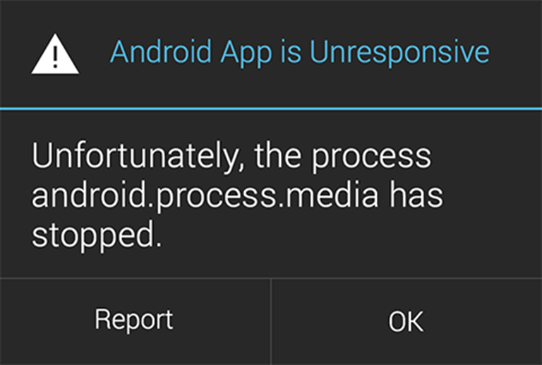
Mobile app crashes and freezes are actually the most common type of technical flaw that immediately sparks outrage in users. And, as you probably already know, once your users are emotionally-charged (in a bad way), that’s when they’re most likely to do something harsh, like uninstall your product (but not before leaving a one-star rating and scathing app review).

Crashes are a leading cause of mobile app abandonment.
Technical flaws will always exist, and it would be unfair to blame your team for occasionally allowing them to happen. However, it would be equally unfair to ignore that technical flaws are a major reason why users abandon mobile apps. Mobile app crashes and freezes are actually the most common type of technical flaw that immediately sparks outrage in users. And, as you probably already know, once your users are emotionally-charged (in a bad way), that’s when they’re most likely to do something harsh, like uninstall your product (but not before leaving a one-star rating and scathing app review).
To get to the source of your product’s crashes, and limit the odds of your audience abandoning your app for good, you have to accurately analyze your app’s crashes as soon as they occur. The best way to do this is by watching user recordings of crashed sessions so that you can see the exact sequence of events that led to a crash. Viewing your app’s crashes from the real-life perspective of your users will allow you to pinpoint the root of your product’s technical flaws and fix them at lightning speed.
Being quick to fix product flaws will protect your brand image, deter angry ratings and reviews, and prevent people from abandoning what you’ve worked so hard to create in the first place.
Bad UX’s happen for all kinds of reasons. But, they occur most often when people install a mobile app under the belief they will receive some specific type of value or feature in return, only to feel let down after downloading the product. This is the worst kind of “buyer’s remorse”, because you’ll almost always lose users each time that this happens without any time for reconciliation.
Sometimes, the value or feature that users want to take from your product already exists in your app, and they may have missed it somehow. Mobile app users can be relentless and impatient in this way, and they normally aren’t going to give your app much time to deliver the goods before they give up on your product entirely.

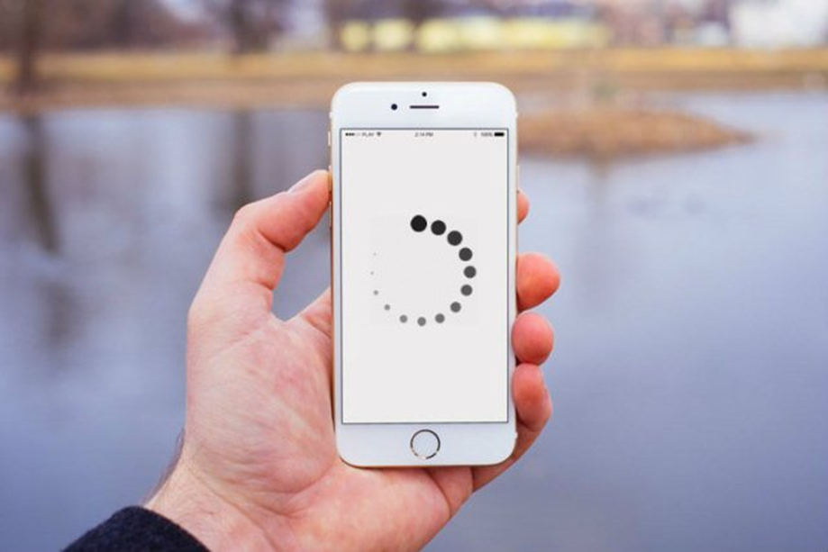
Making users wait while your product loads can harm the UX and increase your abandonment rate.
On the other hand, products with great UX’s take these harsh realities into consideration for every single screen, function and button. Great UX’s are built to accommodate your users’ highly-targeted needs.But, once you’ve built a solid UX as a starting point, you still have to continuously analyze your user experience and adjust your product to your user’s unique needs, behaviors, and standards.
In order to effectively do this, you need to have a tool that will provide you with straightforward, actionable insights on your app. Due to this need; many top mobile teams are turning to qualitative analytics in preference to traditional analytics. What’s unique about qualitative analytics is that instead of using numbers to define something as nuanced and objective as “user experience”, qualitative analytics employs visual tools such as user session recordings and touch heatmaps to show you exactly how users are experiencing your app. Maybe a particular screen within your app has a high quit rate? Or maybe you have an irregularly low number of new users completing your sign-up screen?
Qualitative analytics completely alleviates any guesswork when it come combating user abandonment and improving your product’s UX over the long-term.
Users are quite aware of the fact that ads are the reason why they get free apps. Users love free apps, so they’re willing to tolerate ads, and consider them something of an unavoidable annoyance. However, many still consider them exactly that – an annoyance. If you’re not careful about the ads’ content, placement, and frequency, that annoyance might just tilt the delicate scale in favor of the app being deleted.
So yes, you may add advertising to your app, as long as you consider them placing carefully. Among the more common reasons why ads prompt users to delete the apps are:
Imagine if you gave your five-year-old your tablet to play a game, and he or she ends up viewing a graphic war movie. That’s how you lose users to inappropriate or offensive ads. Or if an app’s screen has more ads than content. Don’t forget that some people pay for mobile data, and if a lot of that data is spent on being served ads, it’s not going to end up well.
Or if (and this is something we come across way too often) your puzzle game serves an interstitial ad every time a user restarts a level? That frequency of interstitials is way too great. And if it just so happens (and boy, does it happen) that the interstitial doesn’t have (or has a very, very tiny) an exit button, you can be absolutely certain you will lose a bunch of your users.
Instagram is a great example of a well-built ad system. Its ads are made to look just like any other post in the app. They are not disruptive, their frequency is just about right, and you only need to swipe up to remove them. With proper monitoring, to make sure no inappropriate or offensive ads get through, Instagram has created a perfect ad system that blends seamlessly with its app.
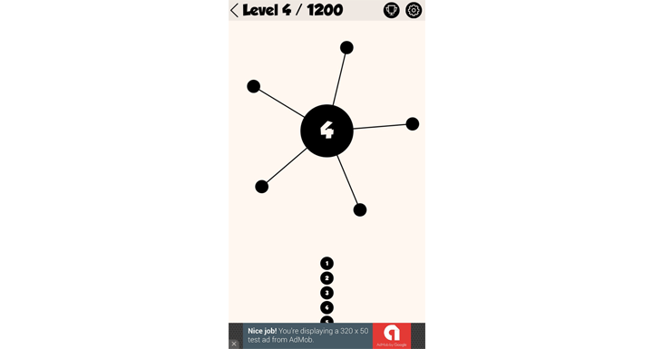
Another solid example of how ads can be used (and not be a detriment to the app’s UX) is one of the most popular puzzle games, AA. In it, ads are placed in the bottom of the screen, where they don’t interfere with the game. After finishing a level, when the user is happy and taking a naturally-occurring break (between levels), an interstitial ad is served. Not too aggressive, not overwhelming – just about right.

Wrapping Up
In order to effectively boost your retention rate you need to take a hard, objective look at your app and assess whether your app is guilty of contributing to any of these reasons.
If you recognized them in any of the five reasons listed here, we’d advise devoting your full attention to these issues until they are resolved. Your users need to be happy if you want to consider your app successful, so start focusing on what’s important – right now. Having plenty of downloads is a significant metric, but so is having satisfied users.
Your email address will not be published. Required fields are marked *